Showing posts with label predictive analytics. Show all posts

Sunday, October 20, 2024

Top Ten Future Disruptions in Society, Economy, Environment, Politics, and Health


Fig. 1 from Policy Horizons report 

According to a (dismal) 2024 report, Disruptions on the Horizon by Policy Horizons Canada:

“Predicting the next big upheaval may not be possible, but it is crucial to explore possible disruptions and anticipate potential future scenarios. Even seemingly distant or improbable events and circumstances can suddenly become reality, while overlapping disruptions can lead to compounded societal impacts.”

The impact and likelihood of 35 possible future disruptions, categorized into five domains: society, economy, environment, politics/geopolitics, and health, is shown on the chart above.  Only four appear to have any good aspects:

  • The North experiences an economic boom,
  • Geo-engineering takes off,
  • Biodata is widely monetized, and
  • Indigenous peoples govern unceded territory.

I have my doubts about geo-engineering, and was relieved to see it is not among the most likely disruptions listed in the report (see below). In fact, only one of the ‘possibly good’ disruptions, Biodata is widely monetized, is listed among the 10 most likely occurrences. 

Unfortunately, of the remaining nine ‘most likely’ four also make the ‘highest impact' list:

  • People cannot tell what is true and what is not
  • Biodiversity is lost and ecosystems collapse
  • Emergency response is overwhelmed
  • Cyberattacks disable critical infrastructure


The chart at the beginning of this report summary also shows the time when the disruption could occur.  This is represented by the shape of the icons and is divided into time segments of 3-5 years (triangle), 6-8 years (square), and 9+ years (hexagon).

As well, the report presents a hypothetical timeline showing when the top ten disruption, (roughly, those in the upper right quadrant of the above chart) will occur. I have not included this timeline as I think it’s misleadingly precise about highly speculative opinion-based numbers.


Sunday, February 4, 2024

Are we reaching a tipping point in global heating?


Alberta Wildfire
watercolour
©2023 Charlene Brown

The National Centers for Environmental Information in the American National Oceanic and Atmospheric Administration provides environmental data, products, and services covering the depths of the ocean to the surface of the sun.

NOAA Chief Scientist Dr. Sarah Kapnick said that the findings of their 2023 climate analysis were astounding. “Not only was 2023 the warmest year in NOAA’s 174-year climate record — it was the warmest by far.”

The impacts of climate change are happening here and now, like extreme weather events that are becoming more frequent and more severe. There were many extreme weather events in 2023, along with record-low sea ice coverage and catastrophic wildfires. In Canada, 45.7 million acres burned, 2.6 times the previous record.

One of the confounding factors making forecasting the future more difficult, which I wrote about three years ago is the phenomenon of tipping points.  These are actions of a complex system which has become unstable.

Are we reaching a tipping point in global heating?

Read Decimation doesn’t begin to describe what happened in Lytton

Or have we already tipped?

Sunday, January 28, 2024

How climate change worsens heatwaves, droughts, wildfires and floods*


1. Hotter, longer heatwaves:   The intense heatwaves that hit southern Europe and the southern US and Mexico in July 2023 would have been "virtually impossible" without human-caused climate change.  And these events are no longer rare. If global warming reaches 2C above the pre-industrial period these events are expected to happen every two to five years.

As well as happening more frequently, heatwaves are becoming longer and more intense in many places.

This can happen as a result of heat domes, which are areas of high pressure where hot air is pushed down and trapped in place, causing temperatures to soar over large areas.  One theory suggests higher temperatures in the Arctic (which has warmed more than four times faster than the global average) are causing the jet stream to slow, increasing the likelihood of heat domes.

2. Longer droughts:  Longer and more intense heatwaves can worsen droughts by drying out soil. This makes the air above warm up more quickly, leading to more intense heat.  Increased demand for water from humans, especially farmers, in hot weather puts even more stress on the water supply.

Climate change has made droughts at least 100 times more likely.

3. More fuel for wildfires:  Climate change is making the weather conditions needed for wildfires to spread more likely. Extreme and long-lasting heat draws more and more moisture out of the ground and vegetation. These tinder-dry conditions provide fuel for fires, which can spread at an incredible speed, particularly if winds are strong.

Rising temperatures may also increase the likelihood of lightning in the world's northernmost forests, increasing the risk of fires. Canada experienced by far its  worst wildfire season on record in 2023, with around 18 million hectares (45 million acres) burned.

Climate change more than doubled the likelihood of the extreme "fire weather" conditions in eastern Canada that allowed the fires to spread, Extreme wildfires are projected to become more frequent and intense in future across the globe. This is due to the combined effects of shifting land use and climate change.

4. More extreme rain:  For every 1C rise in average temperature, the atmosphere can hold about 7% more moisture. The heavy rainfall was made as much as 50 times more likely by climate change, Globally, the frequency and intensity of heavy rainfall events has increased over most land regions due to human activity. And heavy precipitation will generally become more frequent and intense with further warming,


*Outline of an article by Mark Poynting and Esme Stallard, BBC News Climate & Science


Sunday, September 24, 2023

Predictive Analytics: continuing a series emphasizing extrapolating, visualizing (and painting) unanticipated outcomes


Getting caught Greenwashing
Watercolour, crayon and Photoshop™
©2023 Charlene Brown

According to the Harvard Law School Forum on Corporate Governance (July 24, 2023), ‘greenwashing’ is about misrepresentation, misstatement and false or misleading practices in relation to environmental, social and governance (ESG) credentials.

Unfulfilled ESG promises lead to shareholder groups, such as university pension funds, divesting their holdings and to consumers switching brands and boycotting products.

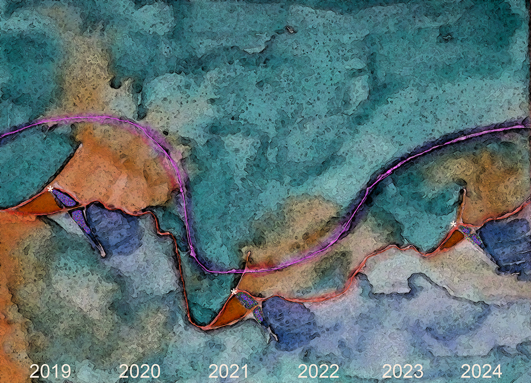
This predictive data visualization is my interpretation of the rise, fall and rise again of stock value (orange line) and product sales (pink line) related to specific marketing events (identified by * in the painting) – a ‘green’ marketing campaign, getting caught ‘greenwashing’ a product or company policy, followed by honest damage control and policy change, over a six-year period. 


Sunday, August 27, 2023

Picking up where I left off...


Cover illustration for a Graphic Novel

Watercolour, Word Photoshop™ InDesign™

©2022 Charlene Brown

Since a horrible afternoon four days after my last blog post, on August 21 of last year, I have been overwhelmed by the sudden collapse, rapid decline and death of my elderly cousin who lived here in Victoria.  She was not my closest relative but I was hers, as she had no brothers, sisters or children.  Although she had several cousins, I was the only one living in Victoria.  Plus we were dear friends.

At first I was unable to write or paint anything I was so distracted by my ever-evolving responsibilities as her next-of-kin.  I did resume painting after a few months, but without much direction, and I have not written anything until now.

At this point I’m going to pick up where I left off on the unfinished projects in my 'Plan for 1150 Words in 2022' as if it had been written in January 2023.

Graphic Novel:  I have stylized some of my representational landscapes to use as backgrounds for the book’s illustrations.  People and conversation ‘balloons’ will be added to these stylized backgrounds.

Creative Archaeology:  I plan to re-interpret some of the photos and sketches I accumulated in past archaeology-related travel with the Art Gallery of Greater Victoria and the University of Victoria travel study program, to continue the series ‘Time Travel with a Bag of Crayons’ working with what I have found to be the only truly portable plein air ‘painting’ kit.

Paint Every Mountain: I will begin compiling a small book about hiking and painting in mountains all over the world, equipped with the same plein air bag of crayons painting kit.

Predictive Analytics: I plan to continue a series which had 14 entries when I stopped writing a year ago.  I will emphasize extrapolating and visualizing (and painting) unanticipated outcomes.

Sunday, December 26, 2021

How my 2021 plans for this blog worked out


 One of the places I might travel to with my daughters
Watercolour and Photoshop™

Travel painting: We’ll see how that goes – bound to be better than 2020, I declared at the beginning of this year.  To my surprise, my travel remained almost entirely virtual, or even bucket list, like the one above, and when I finally got out and painted a landscape, it was only 10 k from home.

Graphic novel: I wrote several blog posts about producing a graphic novel based on a screenplay, but only added six new paintings to the graphic novel I had started in 2020.  It is based on a by-election in a constituency in Alberta… and when the Canadian government called an unnecessary general election in September of this year, I realized there was little interest in elections of any sort, and put that project on hold.

Creative archaeology: In case my travel plans don’t work out, I planned to re-interpret some of the photos and sketches I accumulated in past archaeology-related travel with the University of Victoria travel study program.  I actually added 16 posts, throwing in re-worked paintings from Art Gallery of Greater Victoria trips as well.

Data analytics: I didn’t even mention this out loud in my plan for this year, but during 2021 I ended up following this ‘suggestion’ by the late Robert Genn: 

“There’s always something to get on with, actually one damn thing after another.”

One of the things that I ‘got on with’ was data analytics. In trying to convince some of my grandchildren that data analytics skills will be important for everybody, no matter what their field of study, it’s occurred to me it might be worthwhile to update my own understanding of the various concepts. There are four main kinds of analytics – descriptive, diagnostic, predictive and prescriptive.  I’m interested in predictive analytics, especially extrapolating and visualizing (and painting) unanticipated outcomes. I actually completed 14 blog posts that I tagged as ‘predictive analytics’ seven of which had original illustrations.  The other seven were re-posts of pages from my book, “Inventing the Future.” 

Next week I will post my Plan for 2022.

Wednesday, September 8, 2021

Heuristic input to Predictive Analytics


Cover Illustration for Inventing the Future with Haiku: Whistler P2P
computer painting
©2016 Charlene Brown

Because Artificial Intelligence (AI) has the ability to process ‘big data’ it can be applied to huge problems involving complex systems.  However, in order to be reliable in forecasting the future, it needs to incorporate the intuitive aspect of human intelligence.  

We need to find ways to build common sense into artificial intelligence.

It is possible that properly coded ­algorithms might eventually enable a computer to execute heuristic processes, but it is more likely that heuristic processes can serve as a good first step in data analytics by synthesizing data into a form AI can handle.

Glean as much as you can intuitively before you start quantifying and fitting number-crunching formulas.

I figured this out almost fifty years ago while studying what is now called business analytics.  It was called management science when I got my MBA, and operations research before that.  There was probably a lot less data to mine in the early `70s, but it seemed like a lot at the time. 


1.      The Delphi Technique is a method of arriving at a group opinion or decision by surveying a group of experts (usually in diverse fields) who respond anonymously, then have an opportunity to reassess their answers after seeing the aggregated response. It is especially useful when there is no true or knowable answer, such as in policy decision-making, or long-range forecasting.

·         There are apps that make political forecasts by using AI to comb through Twitter – sort of like a really big Delphi study without having Delphi participants’ opportunity to reevaluate their input.

·         The World Economic Forum Global Risks Analysis, “Visualized: A Global Risk Assessment of 2021and Beyond describes a rigorous method of quantifying expert opinion that sounds similar to a Delphi study, except input is not anonymous. See box below.


2.      Debating at a Policy Workshop: Policy resolutions were raised at the Liberal National Convention, held April 8 – 10 on Zoom. Resolutions had originated with various Commissions and Provincial branches, and were presented and workshopped on the second day. Several dozen were put forward for debate and voting on the final day. 

There were over 6000 of us attending the convention (virtually) and, for each resolution put forward, everyone had a chance to request debate (four debaters were selected and debates were conducted only if there were at least 50 requests – a necessarily arbitrary process) and then vote on whether or not to advance the resolution to the Election Platform Committee. That Committee finalized the Liberal Platform for the September 20 Canadian General Election.

 3.      Visualization: Data visualization, which can distill large data sets into visual graphics, can make it easier to understand complex relationships.  However, as determined in Visualizing Unforeseen Results, visualizations are seldom 'stand alone' documents.  Annotated visualizations may provide more easily understood explanations than detailed text-only analytics.

4.      Ideation Sessions: By employing ‘design thinking’ which considers input from experts in different fields – marketing, design and  engineering – working together, disruptive innovation ideation sessions can enrich discussions.  These sessions help participants to imagine 'what if?’ disruptions such as black swans, wild cards and events such as tipping points occur.

o   Black swan events: unpredictable, massive impact, highly improbable, – eg. 9/11, collapse of the Soviet Union, Covid-19

o   Wild cards: imaginable, low probability, high impact   The difference between Black Swans and Wild Cards is that Wild Cards are imaginable because they have precedents (ie predictable to a certain extent – temperature increases, Halley's Comet, 2008 financial crisis, religious conflicts, financial unicorns or alicorns).  

o   Tipping points: action of a system which has become unstable – eg. effect on crop yields of temperature increases.

Conclusion: Synthesizing information through soliciting wide opinion, debate, visualization, pattern recognition, trend analysis and extrapolation, in other words, going as far as you can in parsing the problem intuitively (heuristically), increases the likelihood of formulating a solvable optimization – and increases the chance the answer will actually make sense.


Saturday, September 4, 2021

Visualizing Unforeseen Results


Exponential Interactions
Computer sketch
©2021 Charlene Brown

In trying to convince some of my grandchildren that data analytics skills will be important for everybody, no matter what their career choice or field of study, it’s occurred to me it might be worthwhile to update my own understanding of data analysis -- and to explore the advantages of data visualization. 

Much has been written in recent years about the unexpected results of climate change. And during the current wildfire season even more has been written about the unforeseen results of climate change exponentially combined with other factors such as decades of fire prevention policy. Too much to comprehend, sometimes.

In Limiting data in search of information, Seth Godin points out, "It’s easy to be in favor of more data. After all, until we reach a certain point, more data is the best way to make a better decision. But then, fairly suddenly, more isn’t better. It’s simply a way to become confused or to stall."

Could data visualization, which can distill large data sets into visual graphics, make it easier to understand complex relationships?

The computer sketch above attempts to show some of the factors in the flow of results, both expected and unexpected, of the following.

Interactions between Forest Policy and Environmental Conditions

One of the unforeseen results of many decades of successful forest fire prevention in North America has been thousands of square miles of overmature, tightly packed, highly combustible conifers, particularly in National Parks — a perfect storm of wildfire hazards.

Climate change is also worsening wildfire conditions, in every possible way — increasing temperatures (especially in the North), heat domes and other extreme weather, dry lightning, pyrocumulonimbus clouds, and a longer fire season.

Meanwhile, over the twenty-year period of significant temperature rise in the Arctic, an unexpected phenomenon, a conifer-to-deciduous shift, has been detected in the taiga region of Canada. This increase in the proportion of deciduous cover has also been noted in Alaska as well, following severe and frequent fires in the boreal forest.

Quite possibly, this vegetation shift will reduce wildfire susceptibility because, as a rule, deciduous trees don’t burn as quickly or intensely as conifers, as I mentioned in my blog post, A word about deciduous trees. https://charlenebrownpainting.blogspot.com/2021/08/a-word-about-deciduous-trees.html. Over time this shift to deciduous forest may even mitigate the rate of climate change by improving carbon sequestration. Deciduous trees remove CO2 from the atmosphere much faster than conifers.

Another eventual good outcome of worsening wildfire conditions is the gradual elimination of problematic reforestation practices.

In the past, for reasons of cost effectiveness and efficiency, timber management policies have allowed:

  •       herbicide destruction of uneconomic deciduous trees
  •       clear-cutting 
  •       reforestation by planting softwood (conifer) saplings in evenly spaced rows on clear-cut land.

Instead of this, multiple species should be planted in clusters (to allow each species to develop and benefit from fungal networks among their roots) with deciduous clusters acting as fuel breaks interrupting vast swaths of conifers. The result would be a healthier, more fire-resistant forest — at a much higher cost than the old way.


Annotated computer sketch
©2021 Charlene Brown

Conclusions: The visualization at the beginning of this article, ‘Exponential Interactions,’ helped organize my thinking but is not exactly a stand-alone document. Annotations are required.

Annotated visualizations may provide more easily understood explanations than detailed text-only analytics.


Sunday, May 16, 2021

Hydrogen – the fuel of the twenty-first century


Blue, green and grey*
Watercolour
©1991 Charlene Brown

According to a recent Pembina Institute paper, hydrogen is increasingly being discussed as a promising fuel that could reduce carbon emissions in the transportation and heavy industry  sectors, and help move Canada toward its goal of net-zero carbon emissions by 2050. However, the climate advantage of hydrogen is dependent on how it is produced. 

Hydrogen can only play a truly significant role in decarbonizing Canada’s energy systems if it is either ‘blue’ hydrogen, made by extracting hydrogen from natural gas and then using carbon capture and sequestration technology to store the remaining carbon or, ideally, ‘green’ hydrogen, made by extracting hydrogen from water using electrolysis powered by renewable energy.

Unfortunately, almost all of the hydrogen now used as fuel is ‘grey’ hydrogen, which is made by extracting hydrogen from natural gas using thermal processes such as steam methane reformation, with no attempt to capture and store carbon.

With today’s technology, ‘grey’ hydrogen can be produced for as little as a dollar per kilogram, and ‘blue’ hydrogen for between one and two dollars.  But ‘green’ hydrogen can cost up to five dollars per kilogram.

 * The painting on the left, ‘Blue, green and grey’ is actually a colour-altered aerial view of Banff from the south.


Sunday, May 9, 2021

Visualization of the incomprehensible


Smutwood Peak
Watercolour and crayon
©2021 Charlene Brown

Einstein was asked to create a metaphor to explain his integrated energy-mass and warped space-time equations, and he said there simply was none. “The words or the language, as they are written or spoken, do not seem to play any role in my mechanisms of thought.”

In the hundred years since Einstein and Minkowski revealed the interrelationships among space/time and light, and proof of the space/time continuum, there has been little speculation as to what could exist on this new plane, apart from Einstein’s discovery that gravity is due to the curvature of space-time in the fourth dimension.  

Artistic visualization of the incomprehensible may produce the beginning of a solution. 

Smutwood Peak is not a visualization of Einstein’s relativity theory.  It just happens to be the only thing I’ve painted this week.  I may use it in the graphic novel I’m working on.


Tuesday, May 4, 2021

World Economic Forum Report: Visualized - A Global Risk Assessment of 2021 and Beyond

Click on image to enlarge

High-Impact/High-Likelihood Quadrant
Source: WEF Global Risks Report
Colour code: risks are ranked from Low (blue) to High (red)

The World Economic Forum methodology is briefly outlined below, and the top risks, as illustrated above, are listed.

Click on image to enlarge

The animated version of Visualized: A Global Risk Assessment of 2021 and Beyond provides an even better visualization, with annotations like the following:

1.      Unsurprisingly, ‘Infectious diseases’ is one of the top risks by both likelihood and risk.

2.      Youth aged 15-24 today are staring down a turbulent future chief among the risks they face being disrupted educational and economic prospects along with potential mental health challenges.

3.      The world’s economic output suffered greatly in 2020, and could continue to stall as monetary stimulus proves less effective while pushing debt/GDP levels higher.

4.      Although COVID-19 has accelerated the Fourth Industrial Revolution, its benefits are not all-inclusive and may worsen existing inequalities.

5.      Several countries are off-track in meeting emissions goals set by the Paris Climate Agreement in 2015.  COVID-19 has also delayed progress in the shift to a carbon-neutral economy.

Note: Economists are apparently required to write within the constraints of their profession (the dismal science).


Monday, May 3, 2021

Data Mining and Synthesis of Information


Illustration from Inventing the Future (Pangnirtung Fjord)
InDesign document
©2019 Charlene Brown

The objective of data mining is to get the largest amount of useful information out of the mountains of data available, and do it without falling into the trap of measuring stuff just because you can, and then tracking useless data to no avail. The way to do this is to glean as much as you can intuitively before you start quantifying and fitting number-crunching formulas.

I figured this out almost fifty years ago while studying what is now called business analytics.  It was called management science when I got my MBA in 1973 and operations research before that.  There was probably a lot less data to mine in the early '70s, but it seemed like a lot at the time. 

Synthesizing information through visualization, pattern recognition, trend analysis and extrapolation, in other words, going as far as you can in parsing the problem intuitively (heuristically), increases the likelihood of formulating a solvable optimization – and increases the chance the answer will actually make sense. 

Sunday, May 2, 2021

2021 Liberal National Convention


Illustration from Inventing the Future
InDesign document
©2019 Charlene Brown

Policy resolutions, including several regarding or relating to Green Energy were raised (in some cases ‘fast-tracked’) at the National Convention, held April 8 – 10 on Zoom. Resolutions had originated with various Commissions (Women, Youth, Seniors) and Provincial branches, and were presented and workshopped on the second day. Several dozen, including four having to do with green energy, were put forward for debate and voting on the final day.

There were over 6000 of us attending the convention and, for each resolution put forward, everyone had a chance to request debate (four debaters were selected and debates were conducted only if there were at least 50 requests) and then vote on whether or not to advance the resolution to the (Election) Platform Committee. We voted in favour of three of the green energy resolutions, rejecting the one that stipulated the decommissioning of all nuclear power generators.

I voted in favour of the three, despite some misuse of the term ‘renewable’ in two of them, and was especially impressed with the third because it referred to alternate (not renewable) energy sources and, in listing them, did not include biomass.  If you read my April 26 blogpost, you’ll know that’s an issue for me.

I’m proud to have taken part in this policy development process, but suspect that whatever American President Biden says in the next few weeks will have much more influence on the eventual Liberal platform.  And on the Opposition Platform.

Saturday, May 1, 2021

Role of Artificial Intelligence:


Illustration from Inventing the Future
InDesign document
©2019 Charlene Brown

Because AI has the ability to process “big data” it could be applied to huge problems involving complex systems.  However, in order to be reliable in forecasting the future, it needs to incorporate the intuitive aspect of human intelligence.  How can that be programmed? 

·         It is possible that properly coded ­algorithms might eventually enable a computer to execute heuristic processes (roughly defined as common sense), but it is more likely that heuristic processes can serve as a good first step in data analytics by synthesizing data into a form AI can handle

 ·         There are apps that make political forecasts by using AI to comb through Twitter – sort of like a really big Delphi study* without having Delphi participants’ opportunity to reevaluate their input.

 * The Delphi Technique can be an especially useful research methodology when there is no true or knowable answer, such as in policy decision-making, or long-range forecasting. A wide range of opinions can be included, which can be useful in cases where relying on a single expert would lead to bias. 

·         The World Economic Forum Global Risks analysis, which I will write about in a few days, describes a method of quantifying expert opinion that sounds similar to a Delphi study. 

·         Design thinking considers input from experts in different fields – marketing, design and  engineering.


Friday, April 30, 2021

Confounding Factors


Illustration from Inventing the Future (Burgess Shale and Emerald Lake)
InDesign document
©2019 Charlene Brown

Forecasting the future is made more difficult by confounding factors such as:

·         Disruptive technology/innovations: Are today’s disruptive transformations (block chain, genome sequencing, robotics, energy storage, AI) comparable to the disruption caused by railways, automobiles, electricity, computers or the internet?

·        Black swan events: unpredictable, massive impact, highly improbable, eg. 9/11, collapse of the
Soviet Union, Covid-19

·        Wild cards: low probability, high impact events.  The difference between Black Swans and Wild Cards is that Wild Cards are imaginable (ie predictable to a certain extent), temperature increases, Halley's Comet, 2008 financial crisis, religious conflicts, financial unicorns (or alicorns), pandemics, wars, and tipping points (abrupt actions of a complex system which has become unstable). 

Using wildcards in disruptive innovation ideation sessions can enrich discussions and help people to imagine 'what if?'


Thursday, April 29, 2021

Forecasting the Future on Zoom


Illustration from Inventing the Future (Gabriola Island)
InDesign document
©2019 Charlene Brown

I won`t attempt to summarize everything I learned in a ‘Forecasting the Future’ class at UVic that I Zoom-attended earlier this month.  Actually I did try to summarize everything, but ended up with way more information than I’d ever try to squeeze onto this blog.  So I’ll just write about the three topics that relate to Predictive Visualization – Complex Systems, Confounding Factors and the Role of Artificial Intelligence.

Complex Systems:

A system is complex if it has diversity, connection, and interdependence.

·         Non-adaptive complex systems follow rules of behavior and equations of physics, and can be modeled and predicted.  Climate projections are non-adaptive complex systems that should be relatively easy to model, except for some randomness and chaos.

In climate modeling, parameterization a succinct mathematical description of a complex process can replace factors like randomness and chaos that are too small-scale or complex to be represented physically.  Millennials would describe parameterization as a hack, by which they would mean a clever, subtle, even mystical computer program – a digital poem, rarely appreciated by non-hackers.

·         Adaptive systems adopt new rules when circumstances change and are harder to model and predict.

Chaos theory deals with adaptive complex systems whose behavior is highly sensitive to slight changes in conditions, so that small alterations can result in unintended consequences. Techniques are emerging to make predictions using chaos theory


Wednesday, April 28, 2021

An Actual Predictive Visualization


Unmet GHG Reduction Targets*
Watercolour, marker and computer
2021 Charlene Brown

 Actual and projected increasing GHG emissions are represented by the solid and dotted black line, with optimistic GHG reductions that didn’t materialize shown in cyan dots.  A couple of surprises which led to economic downturns resulting in sharp reductions in emissions have been labeled in magenta. Surprises vary greatly in the degree to which they may be understood and anticipated.  Visualization and even chaos theory may point the way.

 *Derived from Émissions de GES du Canada: Cibles non-atteintes, produced by Équiterre in 2018. 

Tuesday, April 27, 2021

Incorporating surprises into Predictive Analytics

Not a Predictive Visualization
Watercolour
© 2019 Charlene Brown

Computers are capable of pattern recognition, trend analysis, extrapolation and prediction if the task can be formulated and solved mathematically.

But surprises Black Swans or Wild Cards such as Alicorns can alter the data.  When that happens, computerized analytics must yield to common sense, imagination, heuristic exploration of possibilities and visualization.

I’ll write more about these and other surprises in a blog post about my recent Future Forecasting class at the University of Victoria.


Monday, April 26, 2021

Renewable Energy Rant


Wind Farm in Southern Alberta
Watercolour and crayon
©2016 Charlene Brown

Outdated analyses of the climate change mitigation potential of various technologies refer to ‘renewable’ alternatives to fossil fuels.  In these analyses, biofuels (or biomass), which do not result in significant GHG emission reductions* are combined with other renewables (solar, wind, tide) that have huge potential to make significant GHG reductions, and nuclear energy, which is a whole different class with unique disadvantages (public perception) and advantages (remote location can greatly reduce need for transmission lines or pipelines). 

‘Renewables’ should not be considered as a group with similar climate-change mitigation potential.  Alternatives to fossil fuels should be described as low-carbon, clean or green. These alternate energy sources include nuclear and do not include biofuels.

* Originally, biofuels were viewed as inherently carbon-neutral, assuming the carbon dioxide plants absorb from the air as they grow completely offsets, or neutralizes, the CO2 emitted when fuels made from plants burn. However, this offset is largely negated by the GHGs emitted during the cultivation, harvesting, transportation, and refining processes.  When burned for power generation or heating, biofuels emit about the same amount of GHGs as fossil fuels.

Sunday, April 25, 2021

Data Analytics

Click on image to enlarge

Data Visualization
Mixed media, computer-altered
©2020 Charlene Brown

In trying to convince some of my grandchildren that data analytics skills will be important for everybody, no matter what their career choice or field of study, it’s occurred to me it might be worthwhile to update my own understanding of data analysis.  And to explore the advantages of data visualization. 

The painting above is a visualization of the future effect on GHG emissions caused by three policy alternatives in transitioning off fossil fuels:

  1.       no changes
  2.       carbon tax increasing slightly
  3.      greatly increased carbon taxes

It shows how data visualization can distill large data sets into visual graphics and make it easier to understand complex relationships and predict trends.

As with most projections of the results of policy decisions, these are based on rational extrapolations of observed effects of various fuel types (represented above by different coloured bands) used to produce heat and generate electricity energy, assuming no surprises.

I’ll look at the possibility of adding surprises to these visualizations soon, but first I will write a short ‘Renewable’ Energy Rant.