Wednesday, February 27, 2019

History of Design III


This page from the History of Design shows where the third cross-cultural ‘time capsule’ I compiled last year fits in. Last May I wrote about ‘What the Eighth Century CE looked like around the world’ 

The paintings in that blog post show the blue-highlighted locations in the table above.

Wednesday, February 20, 2019

An addition to the Bucket List (the lake, not the yaks)

Lake Tsomgo
Watercolour and marker
©2019 Charlene Brown


Sometimes when I’m casting about for something to paint, I follow-up on one of the many suggestions Pinterest sends my way almost every day. They have picked up on the fact I often paint what are dismissively referred to as ‘pretty mountain scenes’ and, as I may have mentioned, come up with Moraine Lake two or three times a week.  However, Lake Tsomgo in Sikkim was a brand new idea for them (and for me).

Actually the picture they sent didn’t have yaks in it, but when I Googled Sikkim for information I found ‘15 Top Things To Do in Sikkim: para-gliding, river rafting, challenging Himalayan treks etc.’ The 14 of those things that I wouldn’t dream of doing included riding a yak, but the brightly decorated yaks in the pictures certainly looked paintable. Don’t you agree?

I’ve just come across a blog post by Seth Godin that explains an almost 20-year old term I’d never heard before. I think the advice about yaks that comes at the end of Seth’s post is very important, and it may be some sort of sign that I’ve become aware of it just when I’m uploading this particular blog post so I’m including a link to it here – Don’t shave that yak! 

Wednesday, February 13, 2019

History of Design II


This page from the History of Design shows where the second cross-cultural ‘time capsule’ I compiled last year fits in. Last May I wrote about ‘What the Third century BCE looked like around the world’ 

The paintings in that blog post show the blue-highlighted locations in the table above.


Wednesday, February 6, 2019

Fixing a bad colour choice


The Hoodoos near Banff
Watercolour, crayon and Photoshop
Charlene Brown

The focal point of this painting is an eerily-shaped natural rock formation, but what I’m going to talk about is the mountain behind it (Mount Rundle again, as it happens) which was, for a time, quite eerily-coloured (see detail, below)

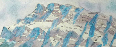
Normally, I paint in the morning in a properly-lit studio, but I wanted this painting to contain distinct shadows on the snow-covered areas as well as the bare rock face. I planned to mask the snowy areas before painting the mountain, so it seemed like a good idea to prepare the painting the night before, putting in the shadows first, allowing time for that paint to dry before applying the masking liquid which also needed time to dry. Anyway, this application of what I thought was cobalt blue shadows, was done under a misleading artificial light, and came out looking like bold veins of turquoise stone. (It was Cerulean blue.)  My first attempt to fix it (a light coating of my favourite crayon) made it quite a bit worse, like the bold veins of turquoise had embedded amethysts! The only solution was to shift the colour using Photoshop, so at least the jpeg of my painting would work.  I liked the result the best when I shifted every colour in the painting.