Watercolour, crayon
and Photoshop™
Charlene Brown
The focal point of
this painting is an eerily-shaped natural rock formation, but what I’m going to
talk about is the mountain behind it (Mount Rundle again, as it happens) which
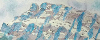
was, for a time, quite eerily-coloured (see detail, below)
Normally, I paint in
the morning in a properly-lit studio, but I wanted this painting to contain
distinct shadows on the snow-covered areas as well as the bare rock face. I
planned to mask the snowy areas before painting the mountain, so it seemed like
a good idea to prepare the painting the night before, putting in the shadows
first, allowing time for that paint to dry before applying the masking liquid
which also needed time to dry. Anyway, this application of what I thought was
cobalt blue shadows, was done under a misleading artificial light, and came out
looking like bold veins of turquoise stone. (It was Cerulean blue.) My first attempt to fix it (a light coating of
my favourite crayon) made it quite a bit worse, like the bold veins of
turquoise had embedded amethysts! The only solution was to shift the colour
using Photoshop, so at least the jpeg of my painting would work. I liked the result the best when I shifted
every colour in the painting.


